Screening
Mammograms, A Closer Look at the Data
An article
by Laura Esserman published in JAMA questions
screening mammography. Dr Esserman reviewed
20 years of data and concludes mammogram screening
programs have "significant
drawbacks and expected survival benefits have
not materialized. While the incidence
of early stage breast cancer has decreased
due to mammography, the incidence rates for
the killer cancers, (the advanced cancers)
have remained stable. While it is true that
overall mortality rates have declined slightly,
this is attributed to better treatment rather
than increased detection."
Let's take
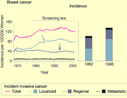
a look at the Data Charts Dr Esserman used
for her JAMA Article. (see below)
Below Image
Courtesy of Rethinking Screening for Breast
Cancer and Prostate Cancer Laura Esserman,
MD, JAMA. 2009;302(15):1685-1692.

The above
chart shows the critical information in Dr
Esserman's JAMA article. The Pink line is
TOTAL breast cancer incidence annually. Note
increase incidence beginning in 1983 with
introduction of mammography screening. Below
the pink line, we see three more lines: this
is the breakdown of the total incidence into
localized, regional and metastatic cases.
The turquoise line is localized cancer. The
Light purple line is regional cancer and the
black line (lowest) is metastatic cancer.
The killer cancers are the regional and metastatic
cases. Note that these numbers have remained
stable with little change in spite of detection
of massive numbers of localized cases.
Read
article at: http://www.drdach.com
|